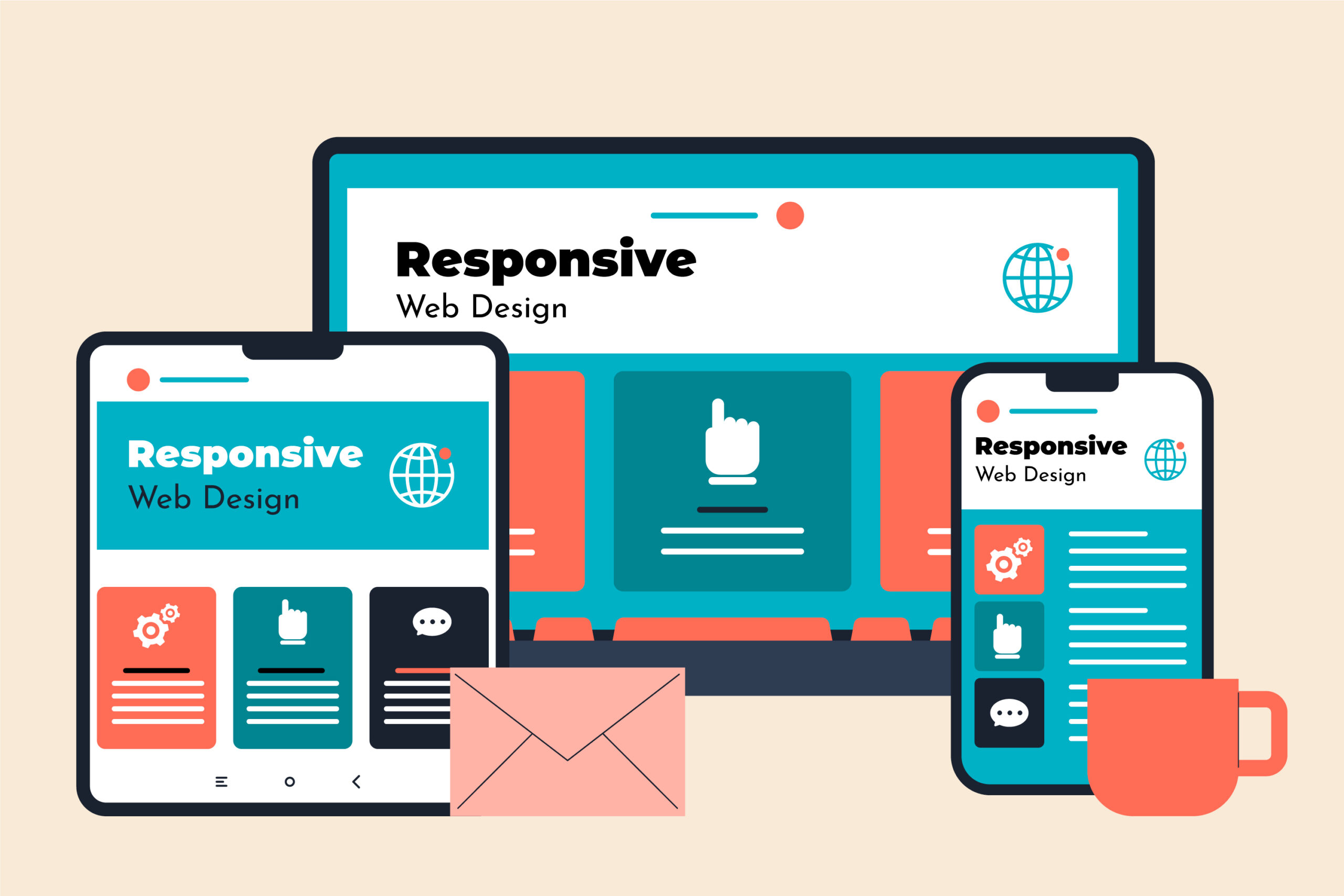
Responsive Web Design (RWD) is a web development approach that allows websites to automatically adapt, resize, and reformat their layout to fit different screen sizes and devices. Whether a user accesses a website from a mobile phone, tablet, laptop, or desktop computer, the website adjusts its layout to provide the best possible viewing and user experience.
Responsive design uses technologies such as fluid grid systems, flexible images, CSS media queries, and the viewport meta tag to ensure content fits properly on any screen. Instead of creating separate websites for desktop and mobile users, responsive design allows developers to maintain a single website that works across all devices.
This approach improves usability, accessibility, and consistency, making it a standard practice in modern web development.
The main purpose of responsive web design is to ensure that websites function properly and look good on all devices and screen sizes. As users access websites from a wide variety of devices, responsive design ensures that content is readable, navigation is easy, and layouts are optimized.
Responsive design eliminates the need to create separate desktop and mobile versions of a website. Instead, one flexible website adapts automatically based on the user’s device. This improves efficiency for developers and ensures a consistent experience for users.
It also helps improve website performance, accessibility, and user engagement, making websites easier to use and more effective.
Responsive web design has become popular due to the rapid increase in mobile device usage. Today, a large percentage of users access websites using smartphones and tablets. Responsive design ensures that websites work properly across all devices.
Some key reasons for its popularity include:
Responsive design allows businesses to reach a larger audience and provide a better digital experience.
Responsive design relies on several core components that allow websites to adapt dynamically.
Fluid grids use relative units such as percentages instead of fixed pixel values. This allows layout elements to expand or shrink based on the screen size. For example, instead of using a fixed width of 300px, developers use percentage-based widths that adjust automatically.
Flexible images scale automatically within their container. This ensures images do not overflow or break the layout on smaller screens. CSS properties such as max-width: 100% allow images to resize properly.
Media queries allow websites to detect the screen size and apply different styles accordingly. For example, a website may show a three-column layout on desktop and a single-column layout on mobile devices.
Media queries enable responsive layouts by defining breakpoints where the layout changes.
The viewport meta tag tells browsers how to scale and display content on different devices.
Example:
<meta name=”viewport” content=”width=device-width, initial-scale=1.0″>
This ensures the website displays correctly on mobile devices.
Responsive design works by using flexible layouts, media queries, and scalable elements that adjust automatically based on screen size.
When a user opens a website, the browser detects the screen size and applies appropriate styles using CSS media queries. Layout elements such as text, images, and navigation adjust to fit the available space.
For example:
This dynamic adjustment ensures optimal usability across devices.
Responsive design and adaptive design are similar but use different approaches.
Responsive design uses flexible layouts that automatically adjust to any screen size. It uses fluid grids and media queries to adapt dynamically.
Adaptive design uses fixed layouts designed for specific screen sizes. The website detects the device and loads the appropriate layout.
Key differences:
Responsive design is generally preferred because it works better across a wide range of devices.
Responsive design offers several advantages for users, developers, and businesses.
Responsive websites provide a smooth and consistent experience across devices. Users can easily read content, navigate pages, and interact with the website.
Search engines like Google prioritize mobile-friendly websites. Responsive design improves search rankings and visibility.
Developers only need to maintain one website instead of separate desktop and mobile versions. This reduces development and maintenance costs.
Responsive websites work on all devices, allowing businesses to reach more users.
Users get the same experience regardless of device, improving brand consistency.
Responsive design is based on three main principles:
Following best practices ensures effective responsive design implementation.
Design for smaller screens first and then scale up for larger devices. This ensures better performance and usability.
Avoid fixed widths. Use percentage-based layouts and flexible grids.
Use responsive images and optimize them for faster loading.
Define breakpoints where layout changes based on screen size.
Buttons and links should be easy to tap on mobile devices.
Always test websites on different screen sizes to ensure proper functionality.
Responsive web design is an essential approach in modern web development that ensures websites adapt to different screen sizes and devices. It uses flexible layouts, media queries, and scalable elements to provide a consistent and user-friendly experience.
Responsive design improves usability, accessibility, SEO performance, and development efficiency. As mobile device usage continues to grow, responsive design has become the standard method for building modern websites.
What is responsive web design in simple terms?
Responsive web design is a method that allows websites to automatically adjust their layout to fit different screen sizes.
Why is responsive design important?
It improves user experience, accessibility, and SEO performance while supporting all devices.
What technologies are used in responsive design?
Responsive design uses HTML, CSS, media queries, fluid grids, and flexible images.
What is the difference between responsive and adaptive design?
Responsive design uses flexible layouts, while adaptive design uses fixed layouts for specific devices.
Does responsive design improve SEO?
Yes, responsive design improves SEO because search engines prioritize mobile-friendly websites.